Working Google reviews: the loop that lifts
Google reviews don't just arrive — they're worked. Five concrete moves to place this week that turn a passive listing into a system of asking, answering and adjusting.
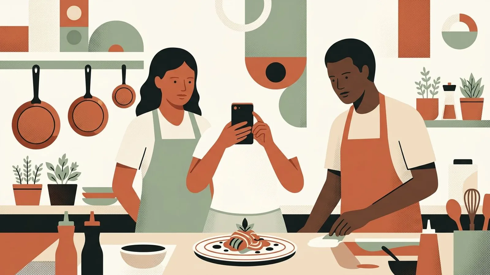
Your plate deserves the full screen. Set one size once, and every photo lands the way you shot it.

The Instagram post size that shows a restaurant photo largest in the feed is 4:5 portrait, 1080 × 1350 pixels; stories run 9:16 at 1080 × 1920, and the profile grid now crops every thumbnail to a tall 3:4. This guide gives you one size per kind of photo you actually take, the dish, the room, the team, the daily special, so you set your phone once and never drag a crop box again, whether you shoot every visual yourself or let an Instagram post generator frame them for you.

Tired of photos that shrink in the feed?
Let ReadyToPost frame every dish and every table for Instagram, then fill the week while you run the service.
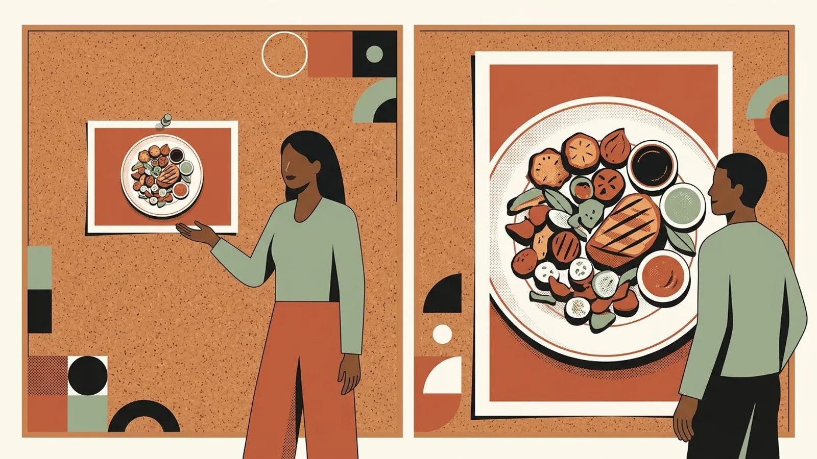
Frame my next postPick one size for everything that goes in the feed: 4:5 portrait, 1080 × 1350 pixels. It takes a quarter more height than a square (1080 × 1080) and more than twice the height of a landscape shot (1080 × 566), which is the difference between a plate someone stops on and a plate someone scrolls past. Instagram also accepts 3:4 (1080 × 1440), the exact shape of the new profile grid; use it if a tidy grid matters more to you than compatibility with the tools and templates that still default to 4:5. Either way, decide once, write it on the kitchen whiteboard, and stop asking the question.
If you keep 4:5, picture a slightly narrower 3:4 window in the center of the frame: that is what the grid shows. Nothing important goes in the outer strips.
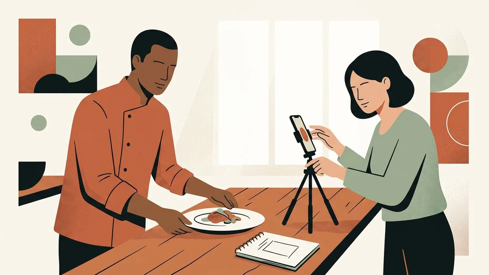
A restaurant shoots four things, and each has a natural frame. The dish: 4:5, from above or at a low angle, plate centered. The room or the terrace: 4:5 still, but step back and shoot vertical, so the depth of the room reads instead of a wide, flat strip. The team: 4:5, one or two people, faces in the middle third. The daily special or the one-night dish: a 9:16 story at 1080 × 1920, because it lives for a day, exactly like the short campaign it announces. What you never shoot as a photo is the paper menu; you shoot the dish it describes and let the caption name it.
Decide which of the four you post most, and make that the photo you take at every service, even when you skip the others.

Most phones shoot 4:3 by default, which becomes 3:4 the moment you hold the phone upright. Hold it vertical, turn on the camera grid, and leave a margin around the plate on all four sides: the crop to 4:5, or to the grid's 3:4, takes a sliver off the edges, never the center. For the dining room, stand at the entrance and shoot toward the back wall, phone upright, so the tables lead the eye into the room. Shoot in the light you actually serve in; a photo of your room that looks like your room is what makes a guest feel the welcome matched the picture.
Take the vertical shot first, then the wide one if you want it for the website. Not the other way around.
Instagram compresses whatever you upload, so give it a clean file: 1080 pixels wide, JPEG at high quality, sRGB. Do not upscale a 600-pixel photo pulled from a booking platform or an old listing; it comes out soft and blotchy. Batch the week's photos to the same size in one go rather than one by one on publish night, and keep every slide of a carousel at the ratio of the first slide, because Instagram applies that one to all of them. If your visuals are generated rather than shot, an AI visual generator built for social formats produces them in the Instagram frame from the start, and the sizing step disappears.
Name the exported files by service and day (tue-lunch-dish, fri-dinner-room). It makes the next step almost automatic.
A size only helps if it is used every week. Set a small, repeatable rhythm: one 4:5 feed photo per service day you want to fill, one 9:16 story per day with the special, one carousel a week that walks through a full meal. Shoot during the quiet half hour before service, export in one batch, and plan the week in a social media scheduler so nothing depends on remembering at eleven at night. Regularity does more for a restaurant account than any single photo, which is why showing up beats the perfect post.
Tie the routine to a service, not to a weekday: the Tuesday lunch photo survives a week where Tuesday is chaos.
What if every post came out the right size, every time?
ReadyToPost builds your dish and dining-room visuals in the frame Instagram shows largest, then schedules the week around your services.
Create my week of postsDo
Don't

Situation
Imagine a twenty-eight-seat neighborhood bistro whose Instagram is fed from the website gallery: wide shots of the room, taken for the homepage banner. In the feed each one shows as a narrow strip, the grid cuts the tables in half, and the owner re-crops every post by hand, differently each time.
Action
The owner sets 4:5 as the house size, writes it on the whiteboard by the pass, and switches the phone grid on. Every service, one vertical shot of the day's plate from above, plate centered, margins on all sides. The room is reshot once, upright from the entrance, in evening light. Files are exported at 1080 wide on Sunday afternoon and scheduled for the week.
Outcome
Each plate now takes roughly a quarter more screen than a square would, and more than double what the old landscape strip gave it. The grid reads as one restaurant rather than a collage, the crop box is never touched again, and a post takes a minute instead of ten. Guests start naming the dish they saw on the way to their table, more often than before. Orders of magnitude, not measurements: what changed is the size, not the food.
Your turn to fill the screen with the plate
A week of correctly sized posts, drawn from your menu and your dining room, scheduled before Monday's lunch service.
Homepage banners are landscape by design, and Instagram shows them at 1080 × 566: a thin band with more white space than plate. A photo taken for a wide screen never wins on a tall one. Reshoot the room upright once; it takes ten minutes and fixes the whole grid.
A photo of the printed menu is text on a 4:5 rectangle seen on a phone: too small to read, cropped on the grid, and dull. Post the dish and name it in the caption. If people want the menu, the link in your bio takes them there.

Instagram applies the ratio of the first slide to every slide. A square first, then a portrait, then a wide shot, and two of the three come out cropped. Pick the ratio before choosing the photos, then keep it, and decide which guest the carousel is for before you decide the order.
A method is set — still, you need time to put it to work. Readytopost frees that time by taking one front off your plate: your presence on the five social networks. Everything written, illustrated, scheduled — calibrated on your work, week after week. So your energy stays on the trade.
Start with ReadyToPostSee how these principles play out day to day. Practice for restaurants gives you concrete, illustrated, adaptable levers — directly applicable the following week. No quarterly plans, no annual roadmaps: weekly gestures that touch something right away.
See it in practice
4:5 portrait at 1080 × 1350 pixels for feed photos of dishes, the room and the team; 9:16 at 1080 × 1920 for stories. Instagram also accepts 3:4 (1080 × 1440), which matches the profile grid exactly, so it is a good choice if the grid is your shop window. Whichever you choose, choose once and keep it.
It still works, and nothing gets cropped in the feed, but a square gives up a quarter of the height a 4:5 photo gets, and the profile grid now crops squares to a tall 3:4 anyway, taking a strip off both sides. For a plate or a room, portrait wins on screen and on the grid.
1080 × 1920 pixels, 9:16 vertical. Keep the plate, and any words you add, away from the top and bottom fifth of the frame, where Instagram lays its own controls. A story is the right home for the one-night dish, the market find, the last three tables, and it fits the rhythm of a thirty-day plan far better than a feed post that has to age well.
Since early 2025 the profile grid shows every post as a 3:4 tall rectangle, whatever ratio you uploaded. A 4:5 photo loses a thin strip on each side; a square loses more; a landscape loses most of it. Keep the plate in the center of the frame and the crop never touches what matters. If the grid still looks inconsistent, the cause is usually a look that changes from photo to photo, not the size.
Yes. 4:5 at 1080 × 1350 displays well in the Facebook feed too, so one export serves both. What changes between the two is the caption and the audience, not the file, which is why one photo can carry a Facebook post and an Instagram post the same evening with different words. Tools that start from your website, like ReadyToPost, do that split for you.

Google reviews don't just arrive — they're worked. Five concrete moves to place this week that turn a passive listing into a system of asking, answering and adjusting.

A tasting, a partnership with the wine shop next door, a one-off dish on a Thursday night: a short campaign can restart momentum — or devalue the rest of the menu and chip away at the margin without leaving anything behind. Five concrete moves to design it, frame it financially, and track it from Monday to Sunday.

A regular who used to come every week and now shows up every two months won't be won back by a marketing email or a discount. Five moves to place this week — named, written, measurable — to crack the door open without forcing it.
Most content idea tables list topics and stall. A row becomes a post only when it carries six decisions, including the column nobody writes: the asset you already have.
A social media manager does four jobs for a small business. Three are production. The fourth decides whether the feed still sounds like you, and it is never on the quote.
Most Instagram bio ideas are clever lines. A business bio is read where you never look: Google's snippet, Instagram search, a profile opened weeks after the post. Ten notes on what survives there.

From a single website URL, ReadyToPost builds your brand profile and starts generating on-brand posts — no manual brief to fill.

Generate social visuals from your real photos — in your style and fonts, in the right format per network. Fix any detail in one sentence.

A semantic memory of your brand's real facts, so every post cites what you actually do and have.
Generate on-brand Instagram posts where the 4:5 feed visual and the caption are built together — a scroll-stopping hook, breathable paragraphs, and full-word hashtags grouped at the end, scheduled and ready to publish.
Generate professional LinkedIn posts, mention real people and companies right in the text, then publish to your profile or your company page.
Generate conversational Facebook posts, set your emoji and hashtag level, and schedule them straight to your Facebook Page. Text and visual built for the feed.
You hold the principles. Readytopost takes the communication off your plate, every week — so your method stays your method.
No credit cardOne week freeCancel in one click